CSS3が使えるようになってしばらく立ちますが、画像等を用意せずに見出しにいろいろなデザインをすることができるようになったのは、とても助かります。
今までその都度、使えそうなスタイルを探したりしていたのですが、使えそうなちょっとこったデザインを、まとめておきます。
-
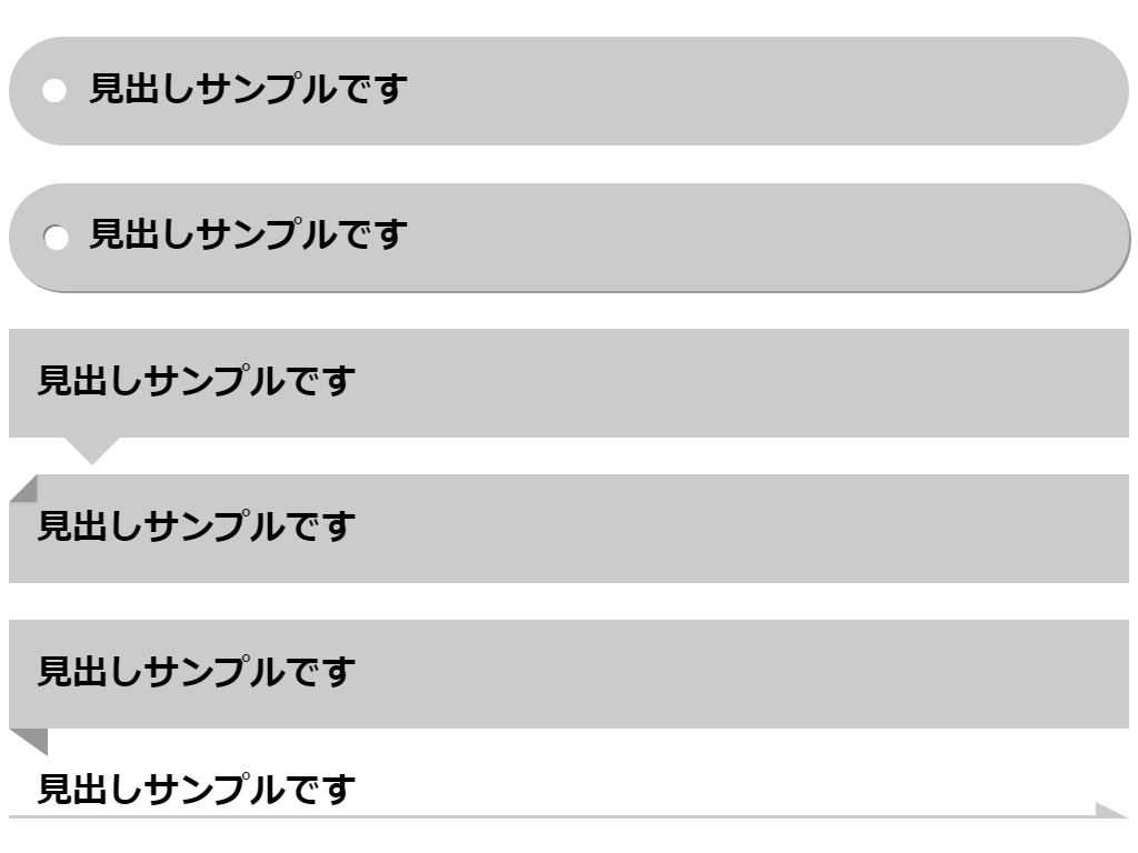
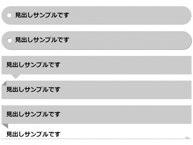
タグ風
見出しサンプルです
-
厚みのあるタグ風
見出しサンプルです
[css]
.midasi01-2 {
background-color: #ccc;
border-radius: 1.25em;
padding: 0.5em;
box-shadow: 2px 2px rgba(0, 0, 0, 0.4);
}.midasi01-2:before {
content: "●";
color: rgba(255, 255, 255, 0.5);
margin-right: 0.3em;
text-shadow: 2px 2px #fff, 0 0 0 #000;
}[/css] -
吹き出し
見出しサンプルです
[css] .midasi02 {
position: relative;
background-color: #ccc;
padding: 0.5em;
}.midasi02:after {
position: absolute;
content: "";
border: 0.5em solid transparent;
border-top-color: #ccc;
top: 100%;
left: 1em;
}[/css] -
ドッグイヤー
見出しサンプルです
[css] .midasi03 {
position: relative;
background-color: #ccc;
padding: 0.5em;
}.midasi03:after {
position: absolute;
content: ”;
border-width: 0 0 0.5em 0.5em;
border-style: solid;
border-bottom-color: #999;
border-left-color: #fff;
top: 0;
left: 0;
box-shadow: 1px 1px 1px rgba(0, 0, 0, 0.1);
}[/css] -
リボン
見出しサンプルです
[css] .midasi04 {
position: relative;
background-color: #ccc;
padding: 0.5em;
}.midasi04:before {
position: absolute;
content: ”;
border-width: 0 0.7em 0.5em 0;
border-style: solid;
border-bottom-color: #fff;
border-right-color: #999;
top: 100%;
left: 0;
}[/css] -
矢印
見出しサンプルです
[css] .midasi05 {
position: relative;
padding: 0 0.5em;
}.midasi05:before {
content: "";
position: absolute;
bottom: 0;
right: 30px;
border-bottom: solid 3px #ccc;
width: calc( 100% – 30px);
}.midasi05:after {
content: "";
position: absolute;
border-width: 0 30px 15px 0;
border-right-color: transparent;
border-bottom-color: #ccc;
border-style: solid;
bottom: 0;
right: 0;
}[/css] -
後ろがとがった
見出しサンプルです
[css] .midasi06 {
position: relative;
padding: 0.5em;
background-color: #ccc;
}.midasi06:after {
content: "";
position: absolute;
border-width: 0 1.5em 2.5em 0;
border-right-color: #fff;
border-bottom-color: transparent;
border-style: solid;
right: 0;
top: 0;
}[/css] -
文字の両側に線
見出しサンプルです
[css] .midasi07:before,
.midasi07:after {
content: ”;
display: table-cell;
width: 50%;
background: -webkit-linear-gradient(transparent 50%, currentColor 50%, currentColor -webkit-calc(50% + 1px), transparent -webkit-calc(50% + 1px));
background: -webkit-gradient(linear, left top, left bottom, from(transparent), color-stop(50%, currentColor), color-stop(currentColor calc(50% + 1px)), to(transparent calc(50% + 1px)));
background: linear-gradient(transparent 50%, currentColor 50%, currentColor calc(50% + 1px), transparent calc(50% + 1px));
-webkit-background-clip: padding;
background-clip: padding;
}.midasi07:before {
border-right: 1em solid transparent;
}.midasi07:after {
border-left: 1em solid transparent;
}[/css] -
チェックマーク
見出しサンプルです
[css] .midasi08 {
position: relative;
padding: 0.5em 0.5em 0.5em 1em;
}.midasi08:before {
content: "";
position: absolute;
width: 0.5em;
height: 0.2em;
border-left: solid 3px #ccc;
border-bottom: solid 3px #ccc;
top: 40%;
left: 0;
transform: rotate(-30deg);
}[/css] -
チェックボックスとチェックマーク
見出しサンプルです
[css] .midasi08-1 {
position: relative;
padding: 0.5em 0.5em 0.5em 1em;
}.midasi08-1:before {
content: "";
position: absolute;
width: 0.5em;
height: 0.5em;
border: solid 3px #ccc;
top: 0;
bottom: 0;
margin: auto;
left: 0;
}.midasi08-1:after {
content: "";
position: absolute;
width: 0.5em;
height: 0.2em;
border-left: solid 3px #999;
border-bottom: solid 3px #999;
top: 40%;
transform: rotate(-30deg);
left: 0.15em;
}[/css] -
>マーク
見出しサンプルです
[css] .midasi09 {
position: relative;
padding: 0.5em 0.5em 0.5em 1em;
}.midasi09:before {
content: "";
position: absolute;
width: 0.5em;
height: 0.5em;
border-right: solid 3px #ccc;
border-bottom: solid 3px #ccc;
top: 0;
bottom: 0;
margin: auto;
left: 0;
transform: rotate(-45deg);
}[/css] -
丸に>マーク
見出しサンプルです
[css] .midasi09-1 {
position: relative;
padding: 0.5em 0.5em 0.5em 1em;
}.midasi09-1:before {
content: "";
position: absolute;
width: 1em;
height: 1em;
background-color: #ccc;
border-radius: 50%;
top: 0;
bottom: 0;
margin: auto;
left: 0;
}.midasi09-1:after {
content: "";
position: absolute;
width: 0.3em;
height: 0.3em;
border-right: solid 3px #fff;
border-bottom: solid 3px #fff;
top: 0;
bottom: 0;
margin: auto;
left: 0.25em;
transform: rotate(-45deg);
}[/css] -
丸帯の頭に丸
見出しサンプルです
[css] .midasi10 {
position: relative;
padding: 0 0.5em 0 1.75em;
background-color: #ccc;
border-radius: 1.25em;
}.midasi10:before {
content: "";
position: absolute;
width: 1.5em;
height: 1.5em;
background-color: #999;
border-radius: 50%;
top: 0;
bottom: 0;
margin: auto;
left: 0;
border: solid 5px #fff;
box-sizing: border-box;
}[/css] -
つぶやき
見出しサンプルです
[css] .midasi11 {
position: relative;
padding: 0.5em;
background-color: #ccc;
border-radius: 1.25em;
margin-left: 1.5em;
}.midasi11:before {
content: "";
position: absolute;
width: 0.3em;
height: 0.3em;
background-color: #ccc;
border-radius: 50%;
bottom: 0;
left: -1.5em;
}.midasi11:after {
content: "";
position: absolute;
width: 1em;
height: 1em;
background-color: #ccc;
border-radius: 50%;
bottom: 0.2em;
left: -1.2em;
}[/css] -
反射
見出しサンプルです
[css] .midasi12 {
margin-bottom: 0;
padding-bottom: 0;
-webkit-box-reflect: below -0.8em -webkit-gradient(linear, 0 0, 0 100%, from(transparent), color-stop(0.4, transparent), to(rgba(0, 0, 0, 0.8)));
}[/css] -
グラデーション下線
見出しサンプルです
[css] .midasi13 {
position: relative;
padding: 0 0.5em;
}.midasi13:after {
content: "";
position: absolute;
height: 4px;
width: 100%;
left: 0;
bottom: 0;
background: -moz-linear-gradient(to right, rgb(204, 204, 204), transparent);
background: -webkit-linear-gradient(to right, rgb(204, 204, 204), transparent);
background: linear-gradient(to right, rgb(204, 204, 204), transparent);
}[/css] -
上下にアール
見出しサンプルです
[css] .midasi14 {
position: relative;
padding: 10px 0;
text-align: center;
margin: 1.5em 0;
}.midasi14:before {
content: "";
position: absolute;
top: -0.25em;
left: 50%;
width: 7em;
height: 2.5em;
border-radius: 50%;
border: 5px solid #ccc;
border-left-color: transparent;
border-right-color: transparent;
-moz-transform: translateX(-50%);
-webkit-transform: translateX(-50%);
-ms-transform: translateX(-50%);
transform: translateX(-50%);
}[/css] -
井桁風
見出しサンプルです
[css] .midasi15 {
position: relative;
padding: 0.25em 1em;
border-top: solid 2px black;
border-bottom: solid 2px black;
}.midasi15:before,
.midasi15:after {
content: ”;
position: absolute;
top: -0.25em;
width: 2px;
height: -webkit-calc(100% + 0.5em);
height: calc(100% + 0.5em);
background-color: black;
}.midasi15:before {
left: 0.25em;
}.midasi15:after {
right: 0.25em;
}[/css]
[css]
.midasi01 {
background-color: #ccc;
border-radius: 1.25em;
padding: 0.5em;
}
.midasi01:before {
content: "●";
color: #fff;
margin-right: 0.3em;
}[/css]
[CSS]テキストの左右に水平ラインをすぅーーーっと引くスタイルシートのテクニック | コリス